Wednesday 30 March 2011

PRINT TO PIXEL.

Goldberg Variations, BWV 988- Variation 1. Quite a happy and jolly song which is very repetitive throughout so I have decided to use the first part of the audio, finishing around 26 seconds; at this specific time, it has a low finishing note which would be a very suitable tone to end the animation on.
I'm very unsure whether I want to create a hand drawn detailed animation such as creating a character or a more abstract piece- experimenting with different materials. Firstly,  I have been researching and coming up with words and information that relate to this audio in my sketchbook. I also want to research existing examples of animation for inspiration- which I will display in this blog.
----------------------------------------------------------------------------------------------
Goldberg Variations, BWV 988- Variation 1:


This was one of the first animated videos I came across while researching on youtube, I like how it has been created using just rough biro sketches. The audio used is a classical tune which goes well with this animation.
This has got to be one of my favourite animated videos, I find it amazing that such an effective animation could come from something as simple as post it notes.
Carphone Warehouse advert...

Monday 14 March 2011

Poster Finished!

I decided to use large text as I wanted it quite dramatic and eye catching, I decided to use a dark lilic shade, which adds just the right amount of colour.
Here are two examples of experimentation on Photoshop, above is one of the examples when I was trying to choose a colour for the text.
Below I started messing around with smaller text and just sticking to black, I feel the larger text works a lot better on the page.


Evaluation:

I feel the poster was quite successful, I am glad I decided to re-take the photos on a white background as it has a more professional look and shows off the design and 3D aspect to the numbers. If I were to do it again or alter areas, I would make the word 'years' into the same 3D shapes as the numbers, however, I would make them slightly smaller and position them in front.

This blog  displays most of the photographs and development of my work and designer inspiration, my sketchbook displays more of the sketches and ideas.

I have come up with the idea of creating the '100' in 3D shapes with a cut out pattern on the back and cut out part of the front so you are able to see the design on the back and this is what I created below...
I decided to experiment and take photos of the 3D numbers in a park near to where I live.

Luckily I finally managed to catch a nice sunny day after many unlucky attempts on many rainy windy days. Although it was quite a still day the numbers kept turning around so it was hard to get a capture when all shapes were facing right way at the same time. However, this flaw could be a positive thing as it does create a bit of interest and movement to the photos.
This photo above is quite interesting, it has a very calm feel to it and fits in well with the background and I like the central composition.
These two images are examples of when I started to change the angle when photographing- aiming upwards, both very similar photos in respect to the composition however, the lighting when captured is different, I think I prefer the one below. (All of these photos are not edited on photoshop, I was tempted to experiment but I felt they were better left untouched.)
I like the idea of the 3D numbers hanging from the trees however, I don't feel it would be suitable for a poster, the background it too much of a distraction and I want to focus mainly on the '100', and add some more lighting to create shadow and emphasise the 3D shapes. So thats when I decided to experiment and capture the numbers on a white background.

...So I then took them inside and these are experimental photos. I changed the setting on my camera so the first few had warmer tones to the photographs like this one below.
I think I prefer this tone below though, as I think the colouring looks a lot more professional and suitable for a poster.
I decided to edit this photo and enhance the colour to make the shadows and shapes stand out more.
Using the feathered lights makes it look quite interesting however, I think I might keep it quite simple and photograph the '100' on it's own so you are not distracted by anything else.
Again, the contrast in lighting has been edited to create a dramatic effect.
Now it's time to add the text, I wasn't sure to keep the text small or continuing following the large style of the '100' numbers.

Task 2

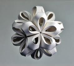
As the task is to create a poster for 100 years of GF Smith paper, I want it to be striking and show off the interesting forms that paper can be made into.

One idea was the subject of 'trees'- I thought this could be a potentially good starting point and theme, after all, paper does come from trees!...

instead of actually constructing a paper tree I thought I could create a series of cuttings of patterns and words- which include the information needed in the poster; I would then physically attach the pieces to a tree outside, the paper could almost 'swoop' from branch to branch. The lighting aspect would be quite a challenge, however, I was thinking if I photographed the work on a sunny day and if I chose a certain location, that the sun could shine through onto the words and patterns- although this is a very ambitious idea, I want to give it ago. To include a 3D aspect to the piece I could include the 3D ball I made in task 1 hanging from a branch.

If this idea fails, a back up idea would still be the shapes, patterns and words carved out 2D however, I would try and add a few 3d shapes, it would then be photographed behind a white background with affective lighting. Another I idea would be to hang the piece in a window and let the natural light be a source to create shadow.

First of all, I will need to do some research on existing designers to get some inspiration; as I want to move away from the circular theme I was going for in task 1, I want to start looking at designers such as Helen Musslewhite's work; I love the use of colour and strong individual designs are very refreshing.

Here she has used numbers on patterned paper- I might use some sort of design on the lettering or even the '100' to make a dramatic statement.

Rob Ryan is a designer who makes very precise cuttings and intricate designs from paper.  
I love the use of colour in this piece; limiting it to just black white and a few dots of orange compliment each other well. 
Again, this is just black and white but with the amount of detail, no colour is needed.
As I am interested in making a few patterns cut out from paper as part of my design, I chose to have a look at the designer 'Shepard Fairey'; his designs are very bold and strong and the patterns are not too small in some of his designs, so would be a great source and inspiration to start working from.
Here are a few pattern designs I came up with in my sketchbook and I feel pretty confident as to which sort of style and design I will work towards in my final


Monday 7 March 2011

Task 1


From making the previous shape, I like the concept of making a circular object for task 1 and perhaps using similar techniques. First of all i think I need to do a bit of research.
The last couple of days I have been keeping my eyes peeled for any structure or design that has a circular nature or pattern. I found this lamp shade(above) in Weatherspoons (quality not so good as it was taken on my camera phone). I love the exaggerated use of circles and the spiral design.
I have also been browsing on the internet to see if anything caught my eye, I have mainly been looking at light fixtures such as this one designed by 'Sukmo Koo and Young Taek Oh'. It looks to me as though this has been made out of card. It almost looks like a sea creature.

I then came across this birdcage by 'Kelly Lamp' designs. I love the simple design and the one triangle thats left.


Richard Sweeney:
Richard's work is a great inspiration to me, I love how he just uses white paper in all is work and it looks so effect and dramatic. He uses many different folds and scores to create fascinating shapes. For example the image below...
He has scored the shape in the middle to make the outline of the hole shapes go inwards, which is very similar to the technique I used in my previous shape, I plan to continuing using this technique in my final piece for task 1.
Above is an interesting shape, all the cut outs are all different sizes and shapes, the light inside enables the circular cut outs to create great shadows in the background.

Here are a few designs I made in my sketchbook before I went ahead with making...

After making a few sketches and designs in my sketchbook I decided to use the same technique as the circular shape I made before; however, this time I wanted to make more of a statement and make the shape look more complex. I decided to cut a circle in the middle of each piece and apply them all together to form a ball like the previous shape. Here you can see that I have used a stapler to hold the pieces together, however I am going to try and use glue and remove the staples as it was have a neater finish for when it hangs in the Atrium.
I think the use of lighting really helps capture the amount of circles used in this piece. The light in this photo below is quite bright and makes it look as if its a light fixture.
Here i wanted to capture the inside, the contrast of the big close up circles to the smaller ones looks quite effective.
I feel that this task was completed successfully and I achieved what I planned to do however, there can always be improvements with anything. I could have also managed my time slightly better and gone for a more complex design or even made more of these shapes in different sizes to be arranged together.