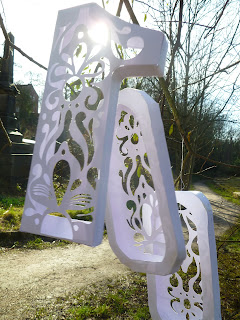
I have come up with the idea of creating the '100' in 3D shapes with a cut out pattern on the back and cut out part of the front so you are able to see the design on the back and this is what I created below...
I decided to experiment and take photos of the 3D numbers in a park near to where I live.Luckily I finally managed to catch a nice sunny day after many unlucky attempts on many rainy windy days. Although it was quite a still day the numbers kept turning around so it was hard to get a capture when all shapes were facing right way at the same time. However, this flaw could be a positive thing as it does create a bit of interest and movement to the photos.
This photo above is quite interesting, it has a very calm feel to it and fits in well with the background and I like the central composition.
These two images are examples of when I started to change the angle when photographing- aiming upwards, both very similar photos in respect to the composition however, the lighting when captured is different, I think I prefer the one below. (All of these photos are not edited on photoshop, I was tempted to experiment but I felt they were better left untouched.)
I like the idea of the 3D numbers hanging from the trees however, I don't feel it would be suitable for a poster, the background it too much of a distraction and I want to focus mainly on the '100', and add some more lighting to create shadow and emphasise the 3D shapes. So thats when I decided to experiment and capture the numbers on a white background.
...So I then took them inside and these are experimental photos. I changed the setting on my camera so the first few had warmer tones to the photographs like this one below.
I think I prefer this tone below though, as I think the colouring looks a lot more professional and suitable for a poster.
I decided to edit this photo and enhance the colour to make the shadows and shapes stand out more.
Using the feathered lights makes it look quite interesting however, I think I might keep it quite simple and photograph the '100' on it's own so you are not distracted by anything else.
Again, the contrast in lighting has been edited to create a dramatic effect.
Now it's time to add the text, I wasn't sure to keep the text small or continuing following the large style of the '100' numbers.


No comments:
Post a Comment